Symmetry in Motion
Arte Di Mare
Arte Di Mare is Ferretti Group's exclusive dealer across the region — carrying Ferretti Yachts, Pershing, Itama, and Riva. Promocell built the brand identity from scratch: logo, palette, patterns, and typography. Then we launched it, on the water.
The Logo
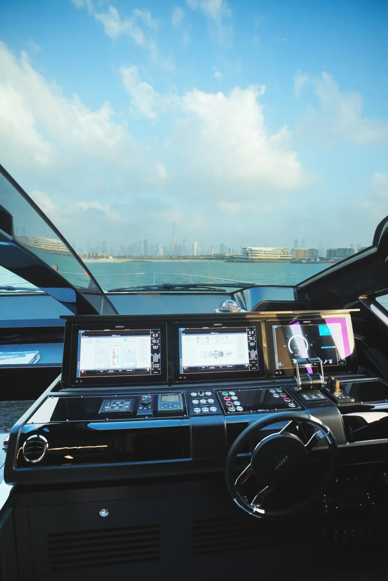
The mark takes its shape from the Riva Diva 82 — mirrored on the waterline. Equilibrium, duality, and the quiet symmetry that every seafarer chases. Two silhouettes meeting at their still point.
The Colors
Symphony blue as the anchor — deep, still, and primary at 80% of every touchpoint. The secondary palette moves outward: the sky-lit blues, teals, and shallows that the sea shifts through across a single day, called on for 20%.
The Pattern
A repeatable system that runs across stationery, digital, and every surface the brand touches without ever feeling like the same beat twice.
The Typography
Two typefaces do the whole job. Felix Titling carries the creative moments — an elegant serif with classic proportions, reserved for display. Avenir Next carries everything else — a corporate sans that runs across three weights, from H1 down to body.
The Launch
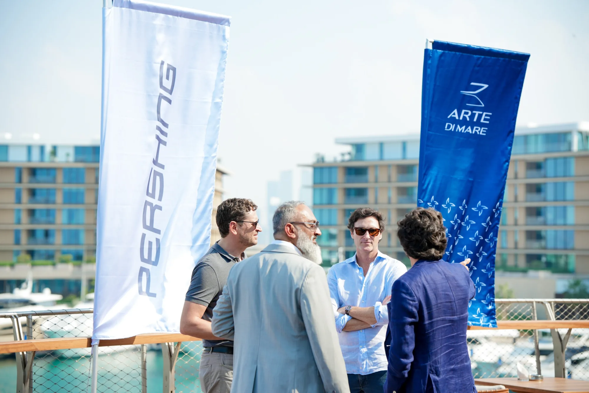
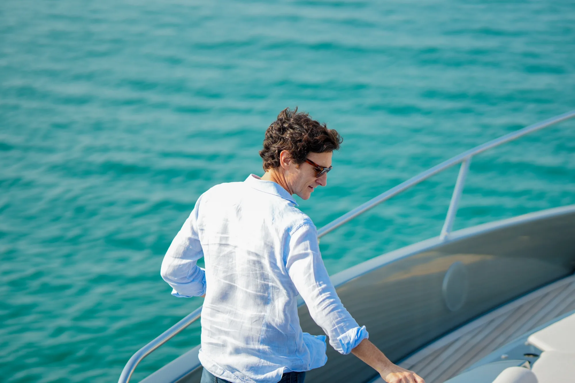
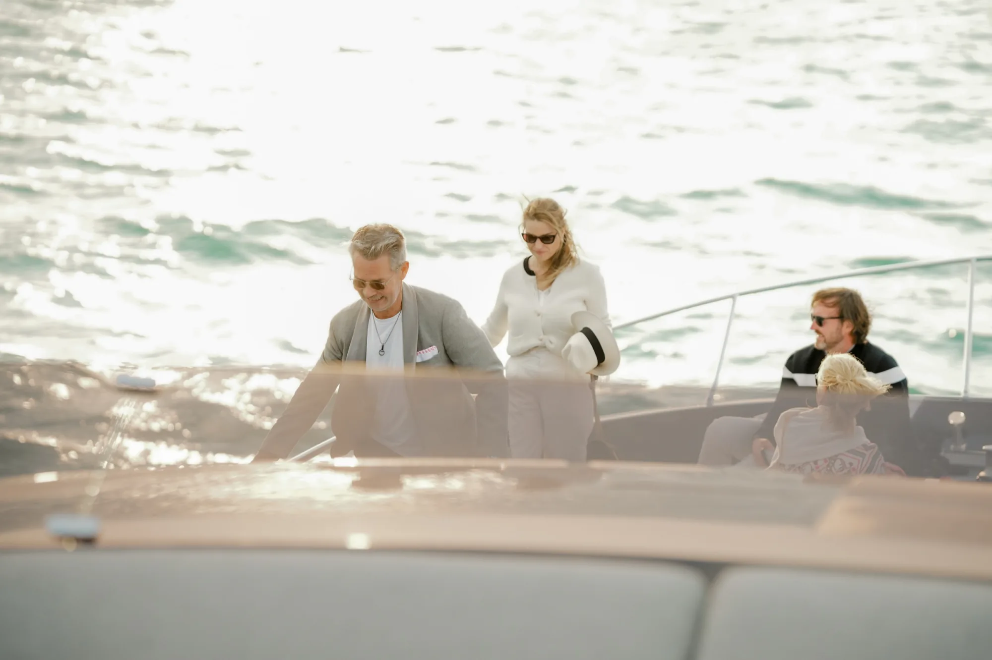
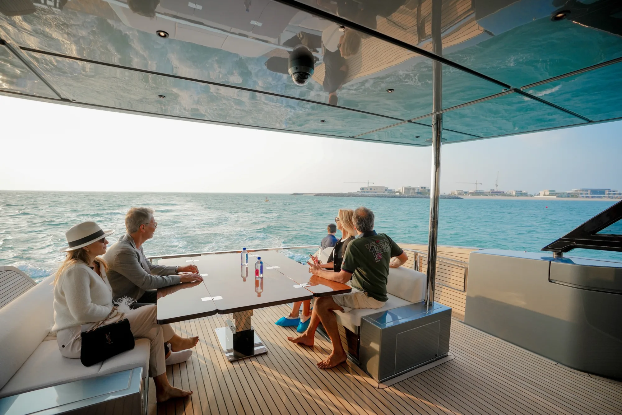
The identity went live at the Arte Di Mare launch event — dealers, guests, and the yachts themselves docked outside.